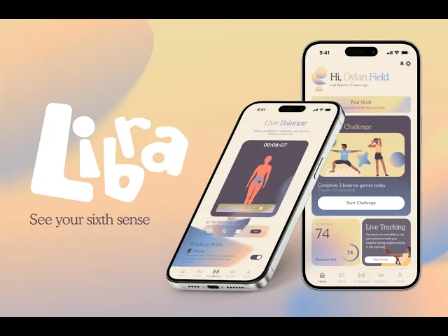

Libra
App Concept
Product Design
Role
Product Designer
Team
4 designers
Timeline
FigBuild 2026
(3 days)
Tools
Figma
Figma Make
After Effects

How we built it
01
Research
10+ interviews with athletes, dancers, PTs
02
Brand Design
Color, type, and assets built for balance and fun
03
App Prototype
Wireframed 50+ screens into one flow
04
User Testing
Real users, iterating on real features
05
Submission
Slides and an infomercial video
Context
The brief: design a tool for a sense that doesn't have a name yet.
FigBuild 2026 asked teams to find something intangible about human sensory experience and design a speculative tool to track and influence it. We built it in one weekend, judged on craft and storytelling over feasibility. I focused on wireframing all flows, prototyping interactions, and conducting research to inform design decisions.
1) Challenge
Track or quantify a sense most people can't currently perceive.
2) Context
Humans have far more than 5 senses; science identifies 22 to 30+.
3) Must Haves
Audience, the new sense, the wellness goal, 3 use cases, safeguards.
4) Constraint
Novel and future-forward, not a remix of an existing app.
A Forgotten Sense
Heart rate lives on your wrist. Blood oxygen's on your phone. Balance still runs on a printed exercise sheet and a Wii board from 2007.
Balance, or equilibrioception, was our sense of choice. It's critical to health yet quietly underserved, still unvisualized in daily life even though the phone in your pocket can already detect it.
Balance affects
36.8 M
people in the United States
Responsible for
38,000 deaths
a year from falling in the United States
Yet there is
No unit
of measurement for balance at all
Sources: Business Insider, National Safety Council

How do you give people a way to see and train a sense they don't even know they're using, with no existing unit, interface, or vocabulary to build from?
Interviewing Users
Three very different audiences, one shared gap.
We interviewed elderly adults, competitive athletes, and people in injury recovery. 80%+ said balance was important to their daily lives, but almost nobody was actually training it.
“I recently sprained my ankle and still can’t put full weight on it. I’m getting physical therapy but I don’t know what the best exercises are and can’t tell if I’m doing them correctly.”
Caroline, Yale Athlete
“Real time feedback is the best, especially as I don’t have a coach. I’m not sure what balance exercises to do.”
Kevin, Runner & Rock Climber
Core Flows
Everyone starts with the same assessment. Where they go next depends on what it finds.
A baseline posture scan and balance test comes first, for every user. Libra branches into one of two paths only after that.
Recovering
Fall patients and balance-disorder patients fighting to get back what they lost: one fall event tends to spiral into weaker balance, fear of falling, and reduced activity. Assess your balance weakness, and recover from persistent issues with detailed breakdowns.

Assessment Mode Highlight
Training
Athletes, dancers, elderly users, and casual users who haven’t lost balance yet but are quietly at risk, or who just want to get better before it becomes a problem. They train daily to build confidence and skill.

Game Mode Highlight
How it works
Assess, track, and improve: built deliberately against clinical aesthetics.
Most health tools look like medical devices. Our tool should rather feel like a partner to your daily balance.
The alerts follow that rule: compensation warnings only surface once a real pattern is detected, not on constant monitoring, so attention stays on the activity instead of the screen.
Design Challenges
No consumer product had ever tried to visualize balance in real time.
01) Visualization
Considering static charts (loses the motion) and raw numbers (loses the direction), we had no reference point and explored finding a visual language for something with none. Referencing the Apple Health app and study programs drove us to find friendly, easily digestible design patterns.

Home Screen Reports and Reminders
02) Comprehension
What does "good" look like for balance? The live view had to communicate quality and risk at a glance, for users with very different levels of body awareness. The result was using shapes and colors to show balance issues and performance easily, built into the app and into the lock screen.
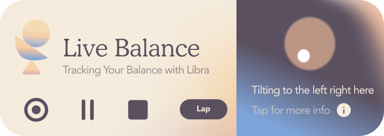
Lock Screen Widget (showing your balance live)
Safeguards
Extra perception comes with responsibility.
Privacy & consent. All device and health data requires user consent, and can be turned off at any time.

Privacy Settings

Fall Safety Warning
Emergency protocol. An unresponsive user during a detected fall triggers an alert to emergency contacts and services.
Reflection
What we learned
Conceptualizing something with no existing visual language, no established metric, and no consumer reference point was the most creatively rewarding part of the process. What does it look like to move around and see your balance on your phone? Every decision had to be built from scratch instead of adapted from something that already worked.