


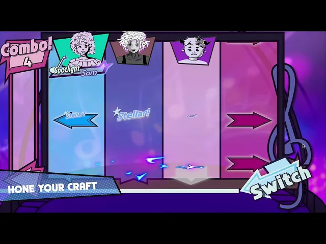

Encore!
Designing interfaces and gameplay for a rhythm game x visual novel
Shipped Game
UI/UX Design
Systems Thinking
Team Leadership

Timeline
Sept. 2024 -
Sept. 2025
Team
23 student developers across four sub-teams
Roles
Project Lead
UI/UX Designer
Game Designer
Context
A rhythm game and a visual novel, fused into one. The whole design problem was making them feel like a single game.
Players enroll at an inter-dimensional music school and recruit a 12-character band to win Battle of the Bands, moving between a visual novel layer and a rhythm game layer.
I designed 9 UI screens end-to-end, from concept through prototyping, in-engine implementation, and user testing, and led game design direction and project management for a 23 person team from pitch to Steam release.
Unique UI Screens
Designed, prototyped and engineered in engine by me
23
Student Developers
Across art, programming, design, music, and writing.
Store Page Visits
Across platforms and releases (Steam and itch.io)
The gap
Forum research found players of both genres, and zero games serving them together.
Using platforms like Reddit and Discord for qualitative research, with DDR, Rock Band 3, Persona 5, and Monster Prom as reference points, I found a real overlap: a meaningful share of rhythm-game fans also play visual novels, with no existing title serving both audiences in one system.

Problem Statement
What do fans expect from a good visual novel or rhythm game on their own?
How do we teach two game systems at once for a hybrid players have never seen?
Ideation
Innovating on rhythm-game mechanics is hard. Innovating on the systems around them isn't.
The team recognized early that reinventing note-hitting itself wasn't realistic within a year, so innovation had to come from the supporting systems and how the two genres' mechanics fed into each other.
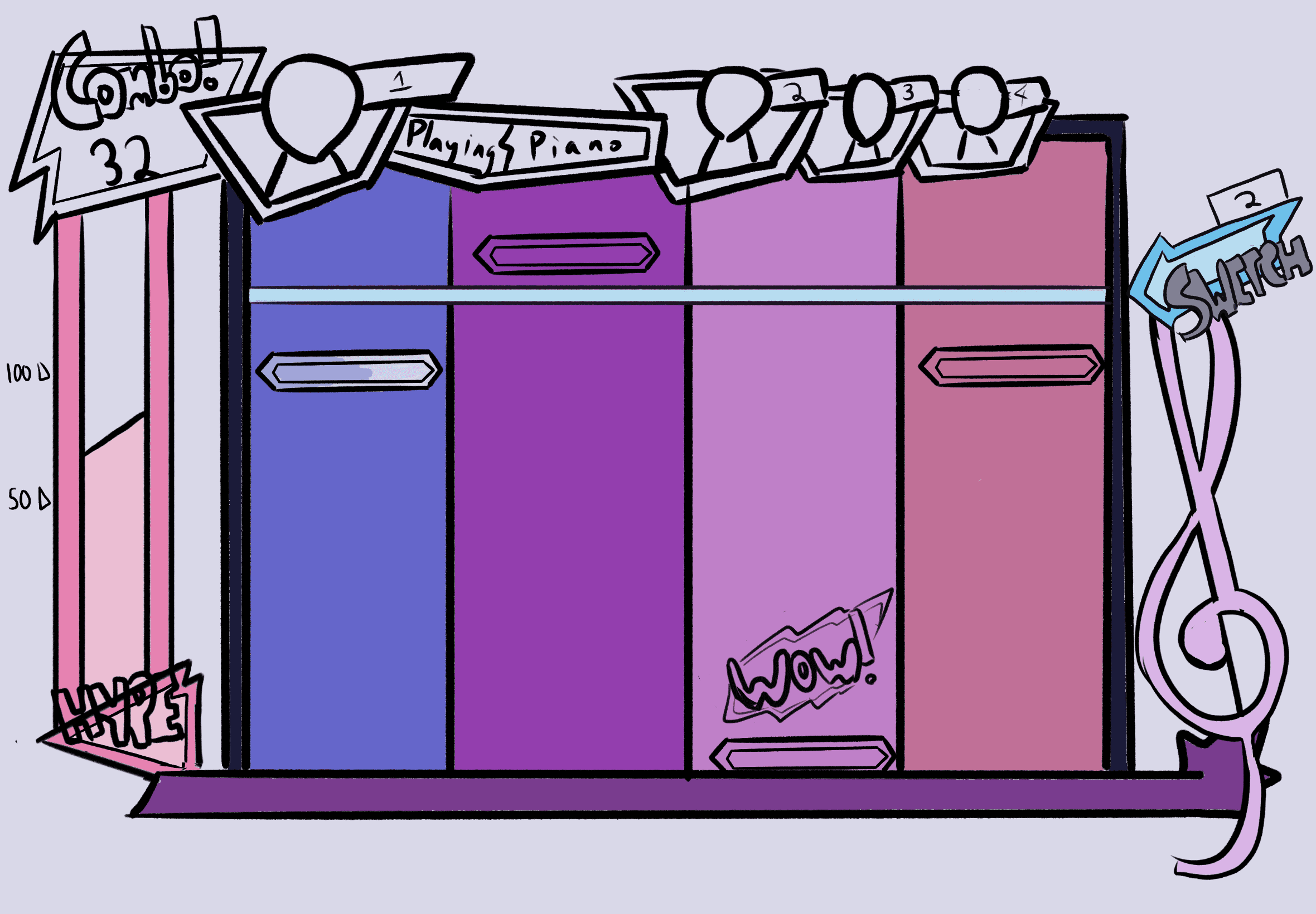
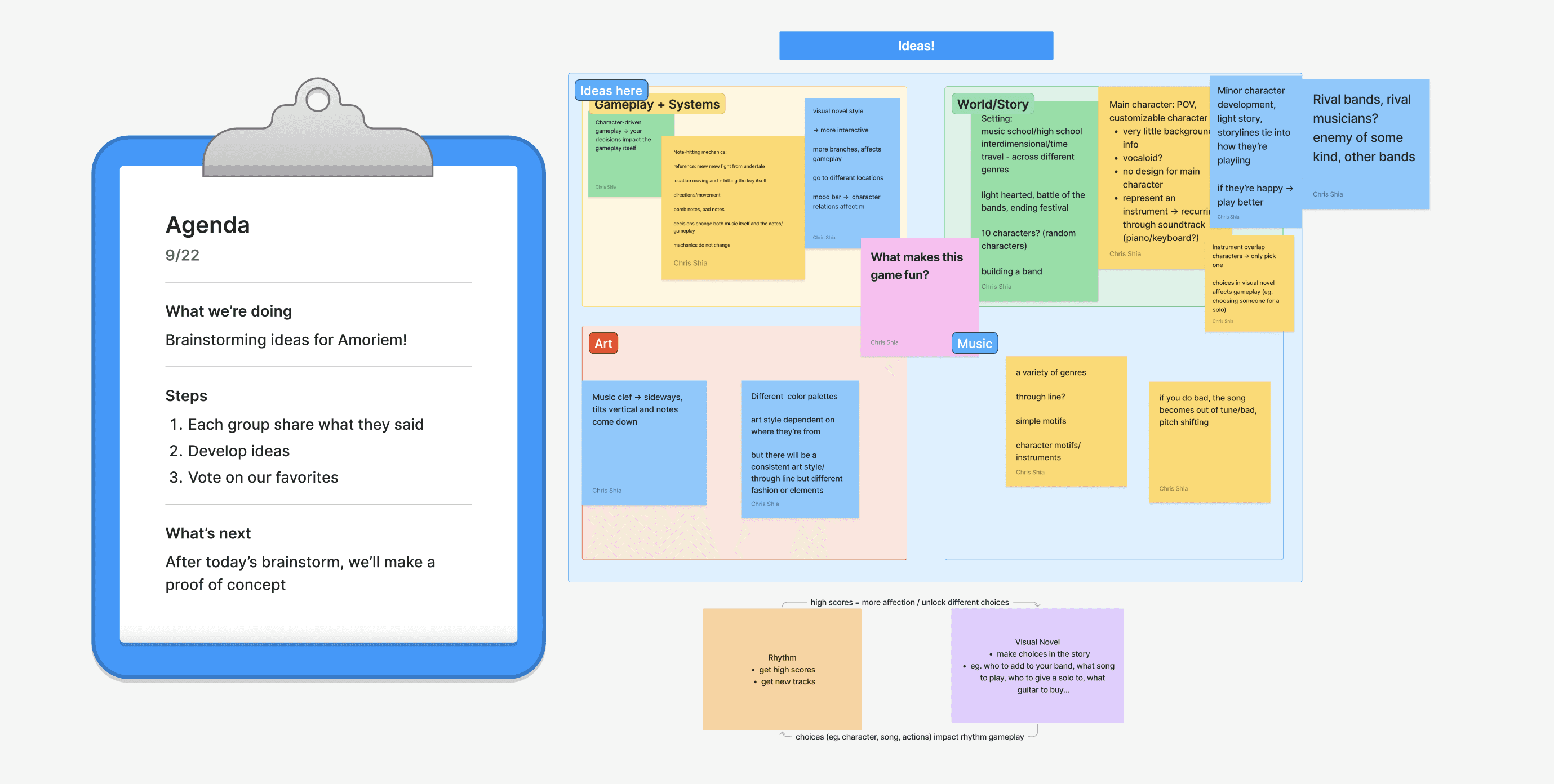
Early Brainstorming Sketches
Core Systems
Three systems tie the story to the song.
The key element of the game was the distinct two phases: a story-based one and a rhythm-based one. To tie the two sections together, I led design of three gameplay systems central to the experience.
Player Journey
How do you let progress in one half of the game unlock the other, without letting players get stuck?
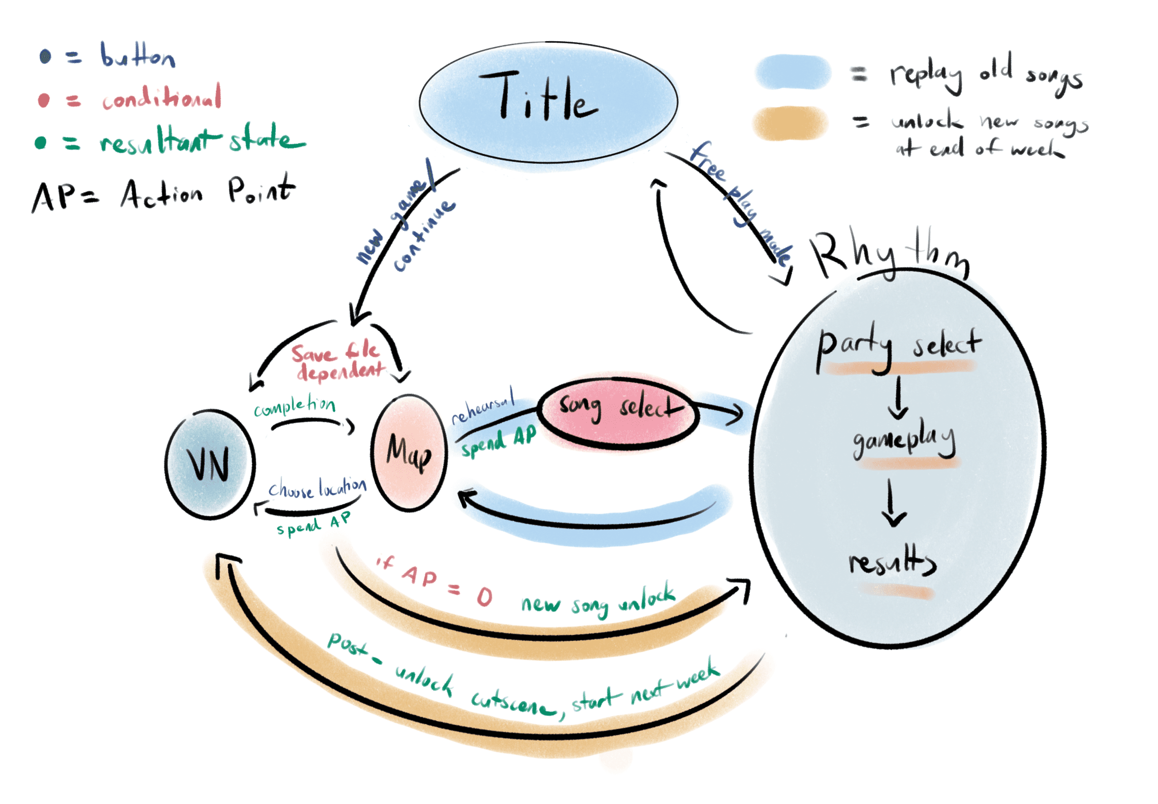
I mapped the full player journey in flow charts to find where the two disparate systems needed a unifying design.
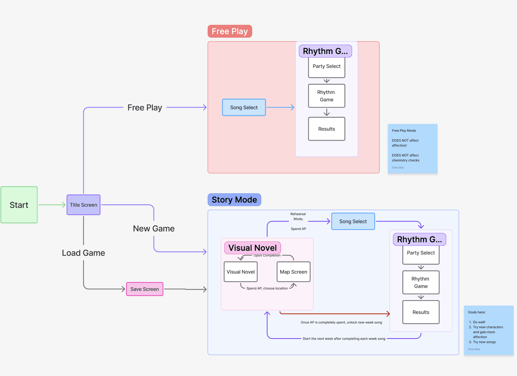
Player Gameplay Flow
How can the game reward doing well in one half of the game to the other while avoiding friction and confusion with two disparate game modes?
The chemistry system.
Chemistry is gained in the visual novel and locks progression in the rhythm game.
Design Roadblocks
One softlock risk, one unreadable scoring system, two design fixes.
Problem: Blocked Progression
Players can be softlocked with no band with a high enough chemistry score, leaving them stuck with no way to progress
Solution
I designed a flexible floor that recalculates the minimum threshold dynamically, paired with new UI popups and dialogue explaining the mechanic in-scene. No tester hit the wall again in the April build
Solution
Flow-charting the exact pain points led to simpler pop-ups and copy that clarified without over-explaining, and improved comprehension in the April build.
Components & Implementation
Nine screens, one visual language, almost no reusable components.
Every screen is functionally unique, so I built consistency through typography, color, and motion instead of a shared component library. This approach led to wildly different screens and a visual language that focuses on poppy, bright, and striking visuals.
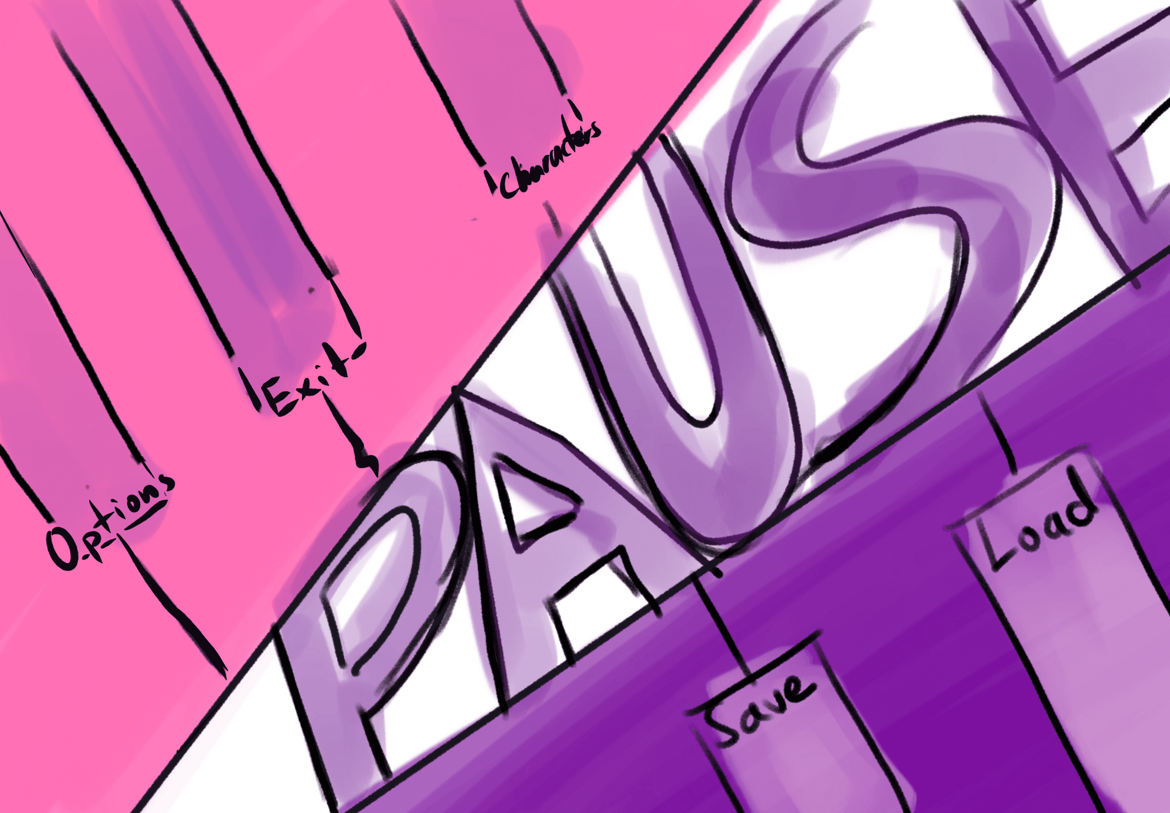

Pause Screen Design Process (Sketch -> Prototype -> Implementation)



UI Element Library Examples
Running the project
Managing 23 volunteers for a year meant treating documentation as a design deliverable.
As Project Lead, I ran the yearlong build through Notion's Kanban and Timeline tools and Discord for day-to-day coordination, keeping a central source of truth for design decisions. With a fully volunteer team, regular check-ins and deadline-based workflows mattered as much as any individual screen.
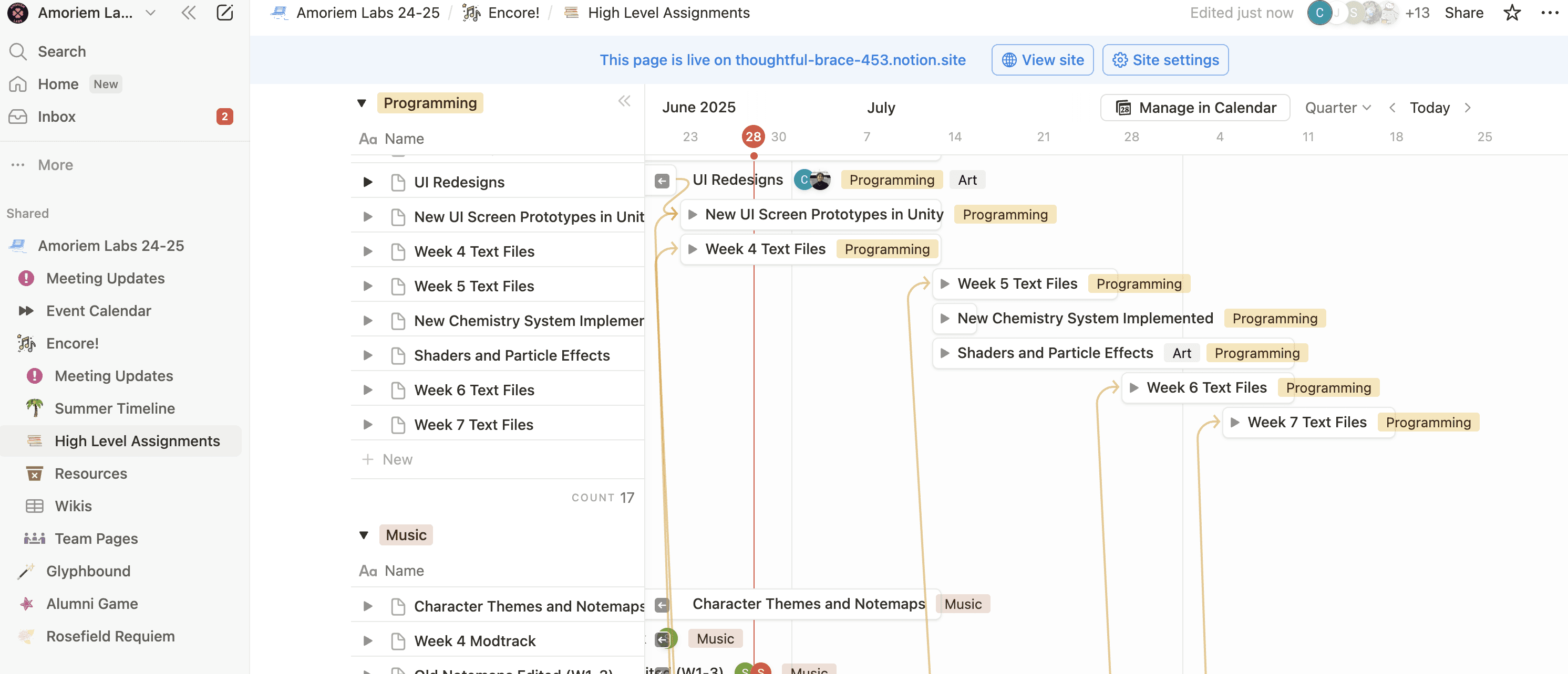
Notion Timeline
Validation
Players loved the style. They got lost in the systems.
An alpha demo in April 2025 drew an 11-response survey plus in-person playtesting.
Positives
UI style and flair
Music and art direction
Narrative style and character storylines
Negatives
Unclear instructions for control schemes
Distracting sound design
Accidental closing of menus and screens
Iterations and Refinements
That fed a focused round of fixes to address user friction for our final release.
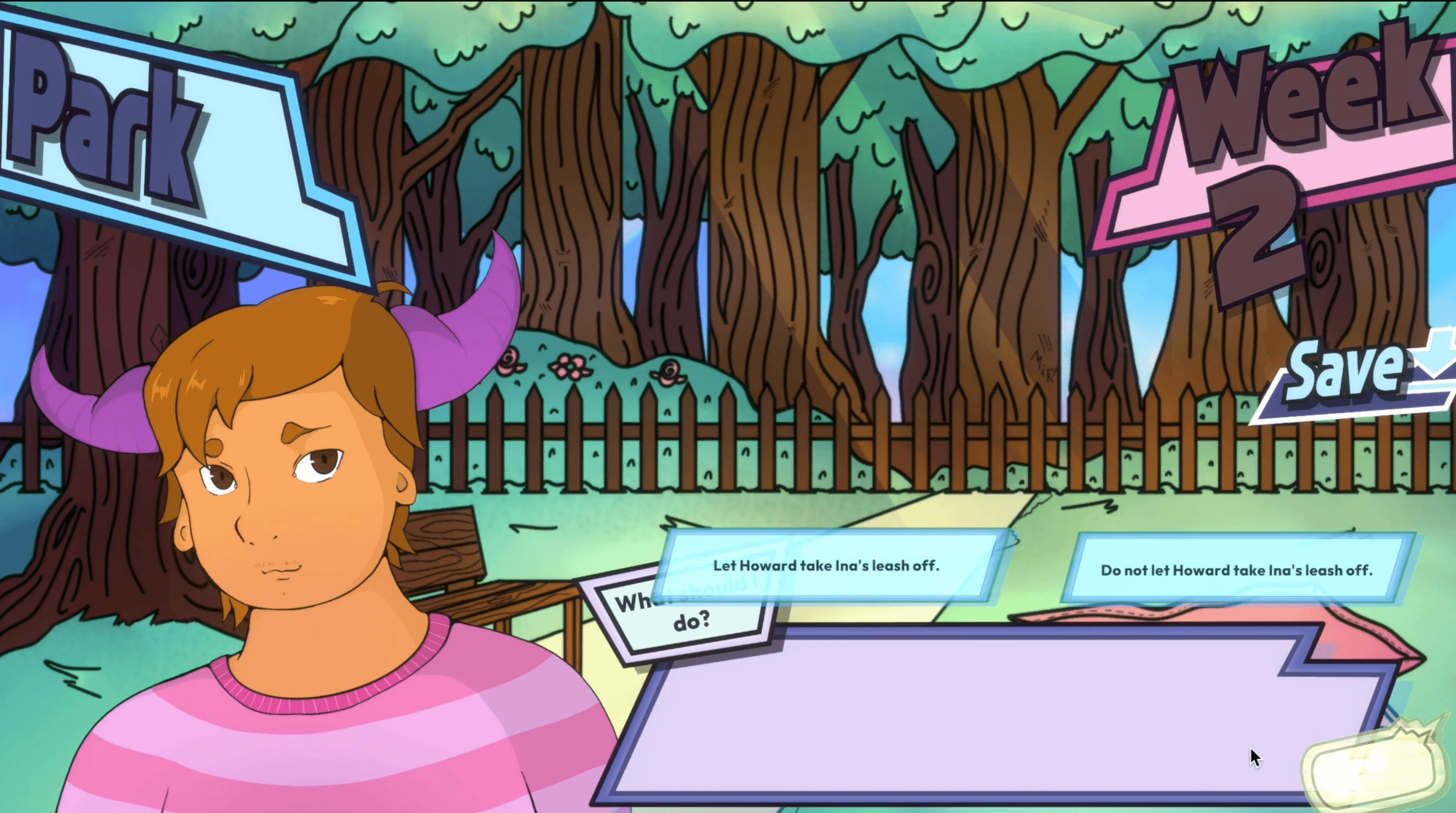
Choice Button Revamp
Clarity of hover and selected state, added flair and animations
Input Control Clarity
Added control scheme icons to signify number keys
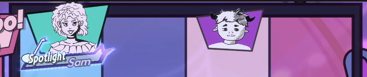
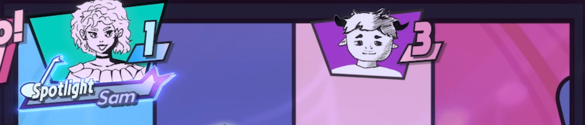
Info Popups
Provide active help to the user with modals on stats, warnings, and underlying systems
Quit Confirmation Warnings
Stop the user and prevent accidental quitting to give clearer guidance between screens.
New Video Tutorials
Replaced text-based tutorials with animated video tutorials for clearer instruction.
Reflection
A UI-heavy game holds every sensory layer to the same bar, not just the screens.
After a year of development and many changing hands, the game is currently out on Steam! The game was also submitted to Independent Games Festival with a full campaign!



What I'd bring with me to my next project…
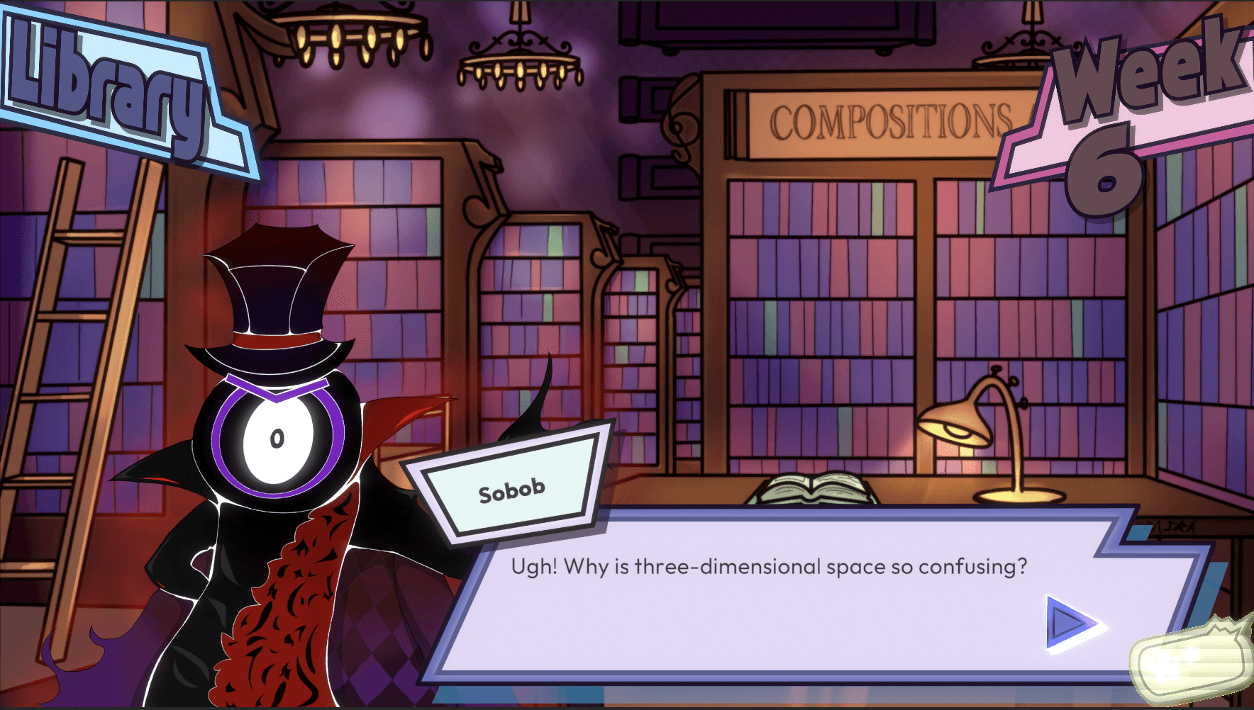
Encore! communicates almost entirely through menus and interfaces, so every decision balanced striking visuals against clarity. The same playtest that praised the art direction flagged the sound design as distracting, proof that a UI-heavy game needs every sensory layer held to the same bar, not just the screens.
My first time directing a team this large, and the hardest calibration wasn't a design problem, rather it was how much direction players and teammates actually needed. Too much guidance made players feel babysat; too little left them softlocked. I learned the balance by flow-charting exactly where players got stuck, then fixing only that.


