breadcrumbs
End to end location based social media app development
Product Design
Frontend Programming
Design Systems
Class Project


Team
4 Full-Stack Developers
1 Product Designer
Timeline
Roles
Product Designer
Frontend Developer
Context
Building an app in two months, design to launch
For Full Stack Web Programming's semester-long course project, four other programmers and I put our heads together to create breadcrumbs . The timeline was tough - two months to go from a concept to built app. We targeted a Gen Z audience to build out an app that would engage younger users in any way possible.
Ideation and Proof
Everyone else solved for when. Nobody solved for where.
What do Gen Z users want from social media? (Web Research)
Authenticity & spontaneity
Being able to return to it consistently and be rewarded for it
Snapchat | BeReal
Reward showing up at the right moment, with gamified action loops. Content unlocks on a timer, authenticity as core draw.
breadcrumbs (our concept)
Rewards showing up in the right place. Content unlocks on location, exploration is encouraged.

Problem Statement
How might we design a social app that rewards people for physically showing up to a place, not just showing up at the right time?
A moment that could only be unlocked by moving toward it.
The concept that became breadcrumbs' core mechanic
User Research
Four user types, one shared instinct: reward people for coming back.
Interviewing 4 Gen Z students, I designed four personas to center my design around.
Communicates through notes and snapshots, similar to a Snapchat/BeReal user.
The Influencer
Enjoys broadcasting to their local community, drawn to apps like Fizz, Twitter/X.
The Gamer
Treats social media as a points system (eg. Snapchat Streaks, Beli)
The Adventurer
Wants to meet strangers through in travel, well-traveled, exploration-minded.
Design Process
Five user flows, one state-heavy feature that needed rethinking.
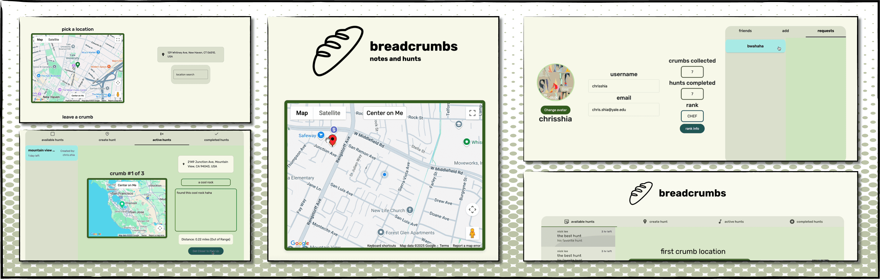
As the sole designer on the team, I built out five core flows: login, write a note, leave a note, manage scavenger hunts, and profile, sketched by hand, then prototyped in Figma. A few of these, like login, writing, and leaving notes were straightforward builds. The scavenger hunt wasn't.
Decision
Split the scavenger hunt game mode into four fixed tabs: Available, Create, Active, Completed, instead of one dynamic view.
Reasoning
The gamification mode's states overlapped in ways that were hard to design and build as a single screen. Separating them into four fixed tabs collapsed that complexity into one clear state per screen, and let every tab reuse the same list/card pattern instead of inventing new UI for each one.

On building the app:
Chose Google Material 3 in React over custom components: velocity was the constraint with a two-month deadline and a mixed-experience team. I also worked on frontend programming in React and CSS styling to accurately facilitate handoff between design and engineering.

How it works
You need to be at the right location to read a note's contents!
Validation
One persona no longer relevant, and changing course to meet our deliverables.
We tested the app with five users before submitting the final product. We saw how they used the app in real time and made the following changes.
Scavenger hunts were too confusing
There were too many steps for the payoff in gamification, and users engaged much more with core flows rather than the game.
Gamer Persona Scrapped
We changed course and focused less on developing the scavenger hunt gamifcation feature, instead focusing on solidifying our core write and read flows.
Results
Winning Best Class Project in the Full Stack course!
Over two months, going from barely any experience in React to a fully functioning app was a great learning experience! Our app was voted by the class as Best Class Project.
User-Generated Breadcrumbs
Class
Full stack is the best class!
new haven tour
a quick new haven tour scavenger hunt
This is good coffee
I need more caffeine!
Reflection
What I'd carry into my next project
Design for engineers, too
Good design is easy to implement — focus on how it actually ships.
Modularity = sustainability
Build with future changes and scalability in mind.
Unique angle = strong hook
Location was our unique selling point, it guided the entire design.